ASA
THE PROJECT
In a world of influencers and followers this recruitment agency for millenials spreads a new claim: What works for you. ASA doesn’t put pressure on its talents, but supports them in finding their own path. By accompanying and supporting their talents from studentlife to young professionals, ASA is willing to fight against today’s hesitancy and to transform todays youngsters into do-ers again.
BRAND IDENTITY
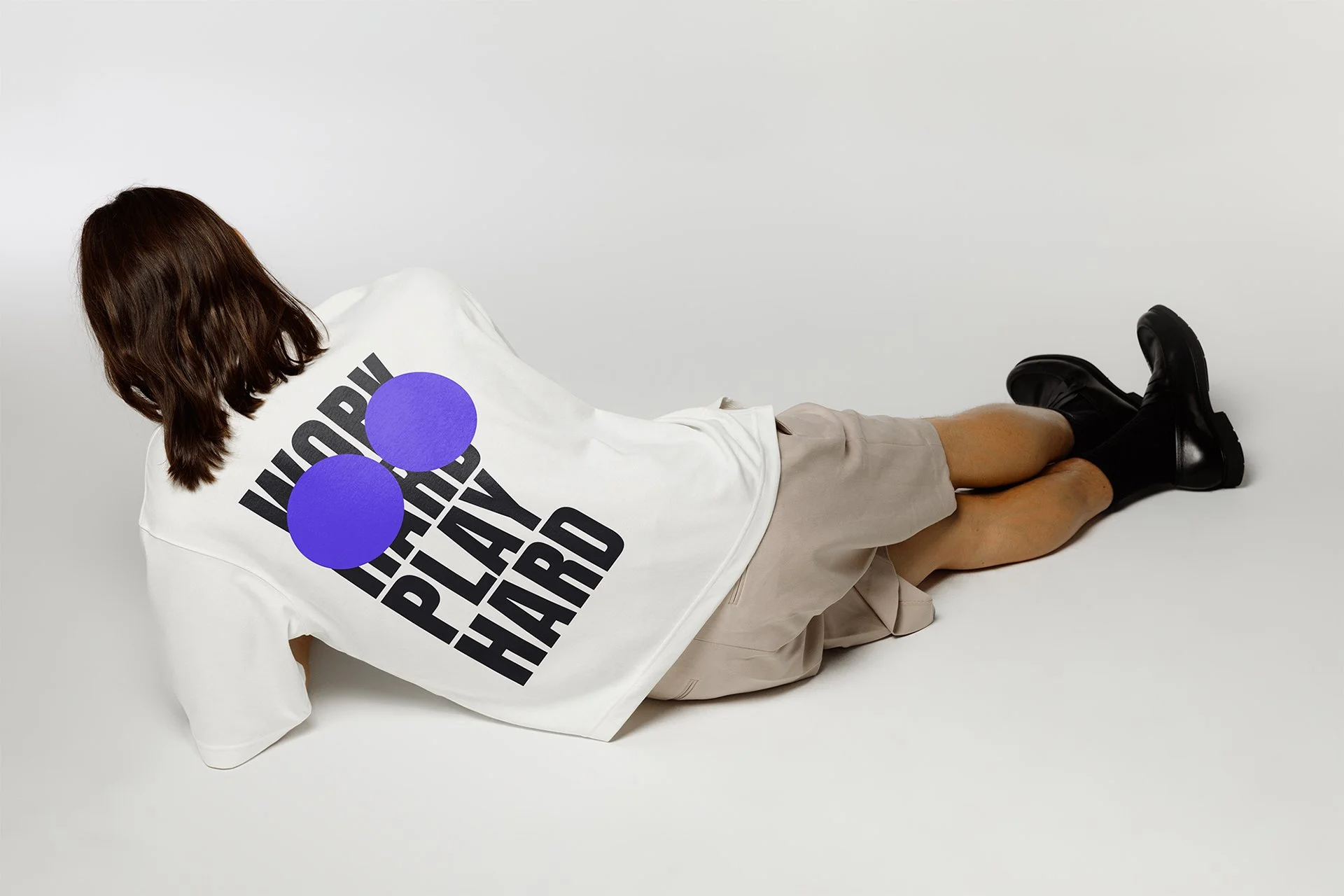
The daring position of ASA was supported by an expressive brand identity: Bold statements were strengthened with massive headlines, written with the condensed sans serif “Anton”, as well as the freefont “arkitek”, which has sufficient similiarities to the logoform. The color choice, yellow and purple as well as offwhite and black, was based on the color palette of the competetive market and combined to craft maximum contrast and expression. The new and old logo is a refound design heritage: The ASA logo crafted by the Dutch design legend Wim Crouwel. A heritage we used as is, without any changes. We brought it into our contemporary world by placing the logo and its pay-off into two bold purple balls, visualizing that everyone should have more than one possibility and power to change your mind. Photography as well as film were placed within the “asa” frame, a squared shape in the form of wim crowls wormtypes “a”.


THE TEAM
Brand Identity and Design Direction: Katharina Goetzendorfer, Yvonne Mak, Campaign Identity and Art Direction: Katharina Goetzendorfer, Copy: Susan Zwijgers, Strategy: Jens Bezmer, Executive Creative Director: Pepijn Rooijens