TASC
BRAND IDENTITY FOR A NEW SCHOOL IN AMSTERDAM
With a big mouth and an even bigger heart, TASC Techschool aims to change the city of Amsterdam and the old worn-out image of technology. The VMBO school prepares 12 to 16 years for a career in engineering and technology. The students learn by doing and work on real projects which are facing major technical challenges the city of Amsterdam.
We are honored to partner up with the makers of the school and help them in their very first steps. We designed a brand identity for a new generation of makers, created a 360 campaign and helped the team within the production of their first school events.
BRAND IDENTITY
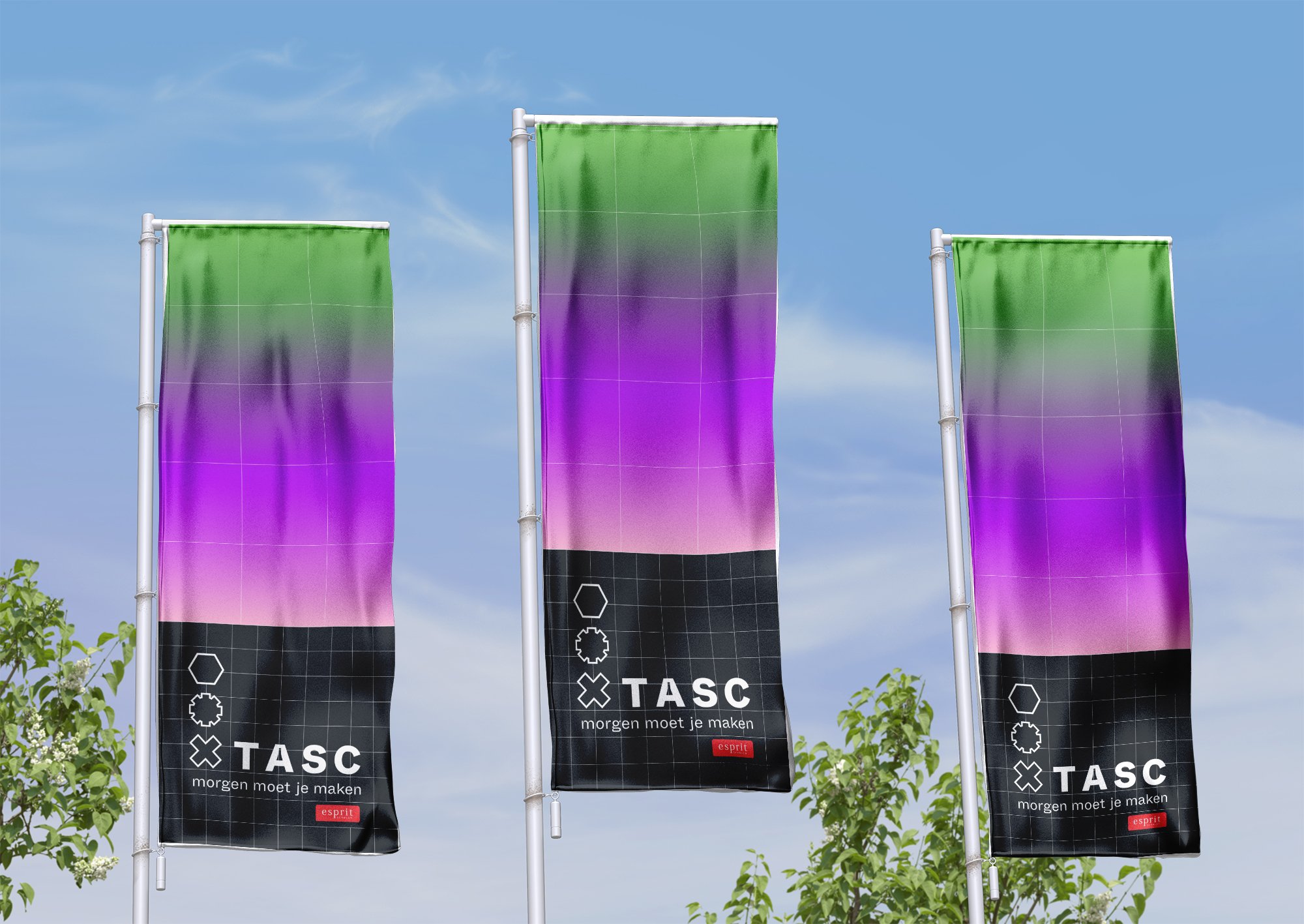
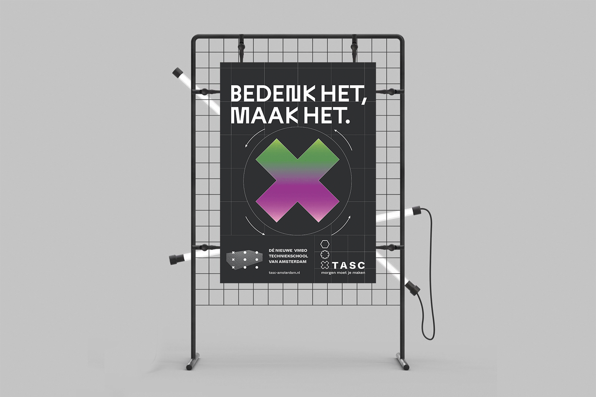
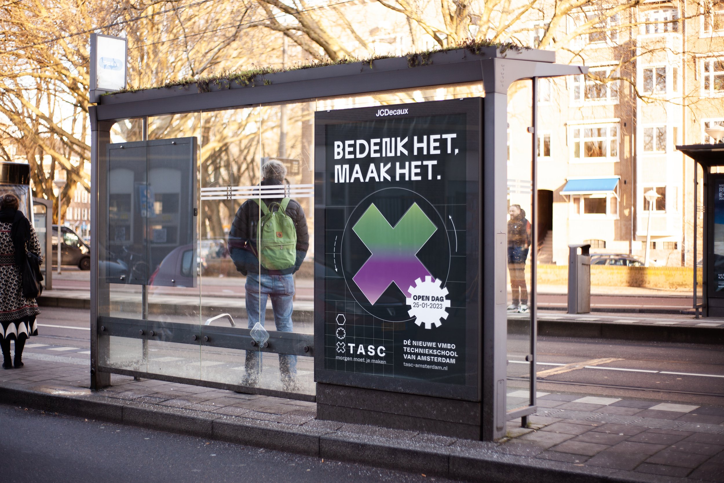
An identity for the new Amsterdamer maker: The shapes of the logo are inspired by screw shapes, while the icon below is derived from the Andrea's cross. The world of technology also finds its visual manifestation in motion, elements move like screws or machines. The grid comes from the blueprint, which provides the basis for new drafts and creations. TASC’s color scheme is inspired by the payoff “Morgen moet je maken”. They interpret air: the sunrise and sunset. The TASC green is derived from the color of the school. Offblack, white and shades of grey are contrasting colors, on which all content pieces are placed on. Due to the high contrast of this tone pairing informations are easier accessible to students with impairments, such as visual impairments and dyslexia.
TASC MAXI
A new school needs a new typeface: TASC Maxi. The newly designed lettering radiates exactly what TASC teaches: techniek. The typeface is based on Johannes Breyer & Fabian Harb's heavily-engineered ABC Maxi Sharp and has been expandedy radically geometric characters.
Since a large number of students in the technical field suffer from dyslexia, we paid particular attention to designing the typeface to their benefit. Each letter is constructed in a different way, making it distinguishable.


TASC LAUNCH
We advertised the new educational institution with an OOH-heavy 360-degree campaign.
THE TEAM
Brand Identity and Design Direction: Katharina Goetzendorfer, Yvonne Mak, Designer: Ejla Miletic, DTP and Design: Jeroen Giesen, Copy: Bart Roggeven, Strategy: Nino Stoffels, Projectmanagment and Production: Maarten Alles, LInda Peterse, Rogier de Vries, Femke van de Water, Jesse Garcia